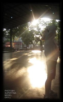
silhouette
by Supertina
(Philippines)
silhouette effect with the use of sun.
Not much for us to go on from this photo, and I have to admit, I’m a little confused.
Is it a photo of the person on the right? If so, they are in an awkward position in the frame. If there is a person in a shot, especially if they are in profile, the photo will almost always look better if that person has some space to look into.
In this case, it would have been better if the person were on the left of the photo, not the right. They would then be looking into the scene, and not looking out of the photo!
There’s also the chopped off feet. Once you notice that their right foot is “chopped off”, it’s hard not to keep looking at it.
Other areas of confusion are the space on the left of the photo – what are we drawn to? For me, nothing much. The shadows? The trees?
Finally I’m not sure how to take the lens flare. It walks a fine line between creative flare, and a poorly aimed camera! Because the flare is irregular I’m tending to lean towards a poorly aimed camera, I’m afraid.
Good lens flare can be achieved by closing down the aperture on the lens where the flare takes on a starburst quality. This isn’t it.
As a final note (and I’m sorry to go on), for a silhouette, it’s not, well, no easy way to say this, it’s just not a silhouette. The foreground has been exposed far too much and we can see far too much detail on the person.
A good silhouette is just that – a silhouette. It leaves it to the viewer to exercise their own creativity a little and wonder what is in that silhouette.
After all that (phew!) thanks Supertina for posting. I hope the comments are constructive. And I’m sure others will tell me if I’m wrong!
Ed.
Is Ed right? What do you think? Make your comments in the box below:
 |
Return to Digital photography tutorials.


