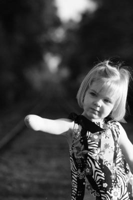
Lila on train tracks
by Julia Taylor
(Colquitt, Georgia, United States)
Photo was taken on Railroad tracks in Georgia, I was not going for a special look, really just playing around with my Canon Rebel, this is exactly how it came out of the camera.
 |
Well I love the shot!
I like that the girl is positioned to one side of the photo. The rule of thirds always makes a good starting point for photographic composition, but as I've always maintained, there's nothing wrong with breaking the rules of photography occasionally.
And in Julie's photo she's pushed the rule to it's limit. The girl in the photo is firmly in the bottom right corner - but it works well!
Another aspect about this photo that I like is that Lila is in crisp clear focus, but the background is blurred.
This is exactly what you should be aiming for with portraits. The effect is called a shallow depth of field and is easy to achieve if you have a digital SLR camera (like the Canon Rebel).
Finally, I love that it's in black and white. Black and white photography works well when there is a good contrast in a scene.
Here Lila is nice and bright and the background is quite dark - perfect!
Lovely photo Julia, thanks for the submission,
Darrell.
Comments for Lila on train tracks
|
||
|
||
We Walk Alone
by Chaitanya Chadha
(Gurgaon, Haryana, India)
A man unknown . . .
- walking to a destination unknown . . .
- through the woods!
 |
(for convenience links below open in new windows)
It never ceases to amaze me how there are photo opportunities around every corner. As long as we follow two simple photographic rules - keep your eyes peeled, and carry a camera!
I like this photo and it works well in black and white.
I like the simplicity of the scene - upright tree trunks, split by that nice diagonal path running through it.
Which brings me onto a simple rule of photography composition - using diagonals.
A diagonal line can really create a strong composition and I think Chaitanya has used it well here.
Of course adding that little extra element can all help bring a mediocre photo to life, and here the extra photographic element is provided by the man walking mysteriously through the woods.
Where is he off to? Maybe he's on his way back? How long has he been walking for? So many questions!
But what this strange man has done to be particularly helpful to the photographer is wear white!
Imagine if he was wearing black - he'd blend in. But wearing white he stands right out from a black background.
So what we end up with is a strong composition and a lovely black and white photo.
Thanks Chaitanya for the submission, and well done for sticking to that second rule of photography - always carry a camera!
Darrell.
For more photography secrets...
Comments for We Walk Alone
|
||
|
||
THINKER
Hello guys,
I am Ketak Shelke I am an artist by profession(painting). I got a new camera recently did not get much opportunity to click many pictures, but I have managed to click some.
This picture is of my friend when he was at my place on the Christmas eve...clicked some pics without him knowing I am doing so. I wanted a natural picture.
Please let me know how it is and please do give suggestions regarding improvements.
Ketak Shelke.
Comments for THINKER
|
||
|
||
|
||
The Brit and The American
by Monica Conley
(Grants Pass, Oregon)
This photo was taken in Big Bear California. My cousin from England(left) and my father(right) were so very deep in conversation I don't even think they knew I took the photo.
It was taken during a time of great sorrow for my family. My little brother died in Afghanistan in the war against terror, during Operation Enduring Freedom.
I thought the black and white was fitting because it takes away the distraction of color and brings you in to the men you see in front of you. Who are they? What are they talking about? Where are they going? What are they feeling.
To me black and whites evoke thought and they force you to see what the artists sees. Nothing more, nothing less.
An interesting photo Monica. It's been said before, but worth mentioning again, photos with a story behind them always seem to be more appealing.
In this case, the story of a family member who died in service evokes feeling. And that feeling is enhanced, I think, by the use of black and white photography.
I don't want to sound picky, and I know I'm not alone on this, but the 'watermark' across the middle is really distracting.
I'm thinking of writing an article about watermarking (so watch this space!), but my general feeling is that, with the low resolution of web based photos, it seems like a pointless endeavour.
But still, I like the photo, has an interesting background to it, and black and white was a good choice in this case. Well done!
Darrell.
Comments for The Brit and The American
|
||
|
||


