my mothers designs
by Dani
( Philippines)

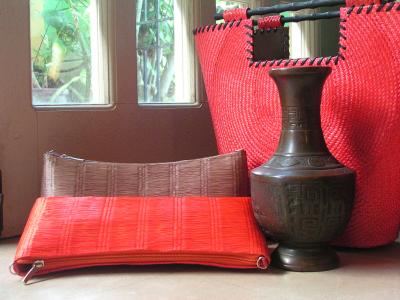
My Mom designs bags and she asked me to take a few photos of them so that she could put a portfolio together.
I just grabbed a few bags a time, choosing the ones whose colors I thought complemented each other.
I decided to add the vase in for some extra visual effect, and I took the photo in our living room.
I just arranged everything on the floor next to our sliding door at an angle.
This is a nicely executed shot. And interesting subject matter – it’s not often we get to cast our critical eyes across home-made handbags!
In a technical sense, the shot is ok. The soft lighting is good, and the colours are complimentary. Perhaps, just perhaps, too complementary?
Outside the window we are tantalised by a glimpse of greenery. Could the odd green leaf have been brought in to balance the shot? Perhaps a seasonal flower from the garden sitting inside an open handbag?
As a photo to advertise the handbags, I think your Mom should be proud of the results. As a creative shot, I’m just not sure>
It’s not that there is anything wrong with Dani’s photo. Technically it ticks a lot of boxes – rule of thirds, complimentary colours . . . what do other’s think?
Ed.
Comments can be made using the box below
 |


