My Autistic Angel
by MiChelle
(Indianapolis, IN)

Kaylie
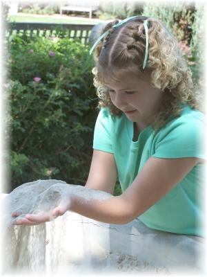
This is my beautiful autistic daughter.
I was hoping to capture her personality in this shot. I did.
Her love of sand or anything like it shows in her face. I took the picture home and softened it a bit and I couldn't be more pleased.
Autistic children are amongst the most genuine kids you will ever meet. They are often very tactile individuals, and tend to develop a deep interest in something (and get endless joy from it) - in this case Kaylie just loves that sand!
Lets look a little closer into Michelle's shot, and see what is good, and what might be improved . . .
First of all, there is that wonderful subject matter – Kaylie. She is clearly focussed on playing with that sand. This is good from a photographic perspective, because taking photos of children can be trying at the best of times.
It is made a little easier if they are concentrating on something. This gives the photographer more time to compose the photo.
And Michelle has picked a good composition here – she's got close in to her subject, and has been able to fill the frame. She has also kept, to some degree, to the rule of thirds. Kaylie's face (a real focal point in the shot) is on one of those "hot" parts of the composition grid.
Then there is the dynamic side of the equation. It's often difficult to show movement in photos, but here the sand moving through Kaylie's fingers is nice to see. Imagine the photo without the sand trickling through those fingers – not so good, is it?
Finally, Michelle has used one of those photographers tricks of using a vignette to help concentrate the viewers' attention.
So is there anything that would improve this photo? Well, yes, there are. And here's my suggestions:
- The composition – it's good, but I would love to see the tips of Kaylie's fingers in the shot too. They've just slipped out the edge to the photo.
- The background – it's too "in focus". With portraits it's good to get the subject in focus, and the background blurred. This is difficult to achieve unless you have a digital SLR (the lenses on compact digital cameras have too great a depth of field).
- My final tip is the colour(s). Now this is really picky of me (sorry!), but the colour palette here is very green/blue. It would have been better if we could have some more contrasting colours in the scene too. Some bright red flowers in the background, perhaps a bright pink tee-shirt . . . This could be done using software, if Michelle wanted to.
Please, please remember that my suggestions here are just that – suggestions. This is a lovely photo, and definitely one for keeps!
Ed.
Do you agree with Ed? Have your say – just type into the box below:
Useful links (open in new windows):


