Mound Church
by Jason Waskiewicz
(Bowman, ND)

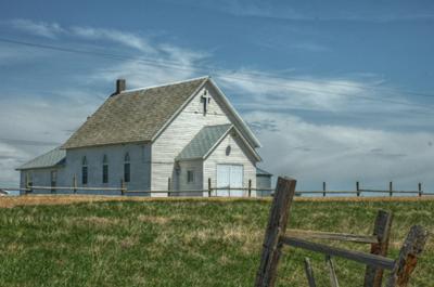
My original (which I still seem to like better)
This is my church. It's a country church located about 15 miles back a gravel road from the nearest highway. I've taken several pictures of it and the ones people always seem to like are from approximately this angle. I took this picture to experiment with HDR.
I want to go back at sunset and redo the picture (better light and the west side of the building will be lit), but that's not really the question.
The question is about composition. I wanted to show the church, but I also wanted to somehow show that it is rural. As a result, I included the grain bin in the background and the old bit of fence in the foreground. My idea was that the fence would draw the eye into the picture.
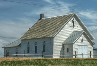
The only really specific comment I've gotten was that there was too much grass and that the old fence post needed to be removed entirely. I agreed with this comment.
I tried this through cropping, but the result seemed a bit lacklustre.
 |
Ever watched "The Italian Job"? The 1969 British classic movie I mean.
It's a brilliant piece of cinema. The storyline itself is top-notch.
Who could fail to be charmed by a group of criminals trying to steal a stash of gold by bringing Torino to a standstill, outwitting both the Mafia and the Italian Government at the same time?
And all this masterminded from a prison cell back in Blighty.
With the addition of the original Mini (small enough to drive through sewers) and a genuine cliff-hanger dilemma at the end it has more twists and turns than a plate of spaghetti.
Perfect.
And then they made a sequel. Not immediately, but in 2003. Actually it wasn't really a sequel as it made no attempt to move the original story on a bit. More a re-make.
Gone was the suave leading man, gone was the classic Italian scenery, and gone was the iconic Mini.
Instead the criminals attempt a robbery by bringing Los Angeles to a standstill. Which from what I've read happens pretty much on a daily basis anyway.
My point, in a very large nutshell, is that there was no need to make the second movie. The first was perfectly good as it was.
Which brings me onto Jason's photo.
The original was, to my mind, a pretty decent shot. The sequel (or re-make) was a mistake I think. Better off to stick with the original.
But I share the comments that Jason has already received – maybe too much grass and maybe the fence post in the foreground gets in the way.
When faced with this you can either try to cut out those elements of a photo (which Jason did with his cropped photo), or you can use them in the scene.
In this case I think I would try to use them in the scene.
Before I go into that let me go through a compositional technique – giving space to your subject.
Usually this is explained when photographing a person running. If the person is running from left to right you should position them on the left of the photo, giving more "space" on the right side of the photo for them to "run into".
If you crop it too close, by placing them in the middle of the photo for example, it feels a bit like they are about to run into the side of the photo.
The same can be said of Jason's cropped photo. The church is facing to the right and therefore needs more space on the right side of the photo – to "look" into.
When you take away the space it feels like it's looking at the harsh side of the image. It needs space on the right side of the scene.
That's why the composition of the second photo doesn't work so well.
So what could be done? What if you got the other side of the nuisance fence posts and took a photo lying on the grass? The grass would fill the immediate foreground and the church would rise up from it – quite impressively I suspect.
There is little you could do about the fence line near the church itself. But then that’s part of the whole church and I don't think would spoil the shot.
Thanks for the submission, and I hope it's provided some food for thought,
Darrell.
Comments for Mound Church
|
||
|
||
|
||
|
||
|
||
|
||
|
||


