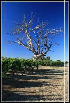
Dead Tree
by Rachel Farran
(Kumbia, Queensland)
What do you guys think of this? I believe it's my best work yet.
If there were an art competition, I would enter this shot. What are your thoughts on it?
Am I a little ahead of myself here?
Thanks
Rachel
This looks like a nice shot.
Good things about this photo are the colours. The sky is incredibly blue, and the vines are richly green.
The time of day has helped with this photo. It's late in the day and so there are long shadows. This adds some interest in the foreground.
It also adds to the tree – the shadows causing one side of the tree to be brightly lit, and the other to be in shadow.
But what really grabs my eye here, and not in a good way (sorry Rachel), is the frame.
The shot was good, the colours were bright, but I can't see what the white frame in the photo adds. If anything, it is a distraction.
I feel that if the photo had been left with just the black border (and maybe the white inner border) it would have been a better shot.
I'd be interested to know what others think though – maybe I'm just a bit set in my ways!
Thanks for the submission Rachel,
Ed.
Want more tips? Get our recommended eBook.
Read a hands on review here
Comments for Dead Tree
|
||
|
||
|
||
|
||
|
Click here to add your own comments Return to Digital photography tutorials - submissions, May 2008. |


